DESIGN & TESTING
We were ready to start thinking about concrete solutions to our design challenge after wrapping up our discovery phase. We reviewed our research data and translated our findings into an app that would support our users’ needs.
OVERVIEW
After determining requirements, we went full steam ahead on iterative design.
REQUIREMENTS
Since we only had six months to work on this project, we wanted to make sure we could deliver a high-quality solution that addressed our client’s needs without expanding the scope beyond what we would be able to finish.
1. Scope definition
After getting approval from our client on the pitch, we worked with them to clearly define the scope of our project.
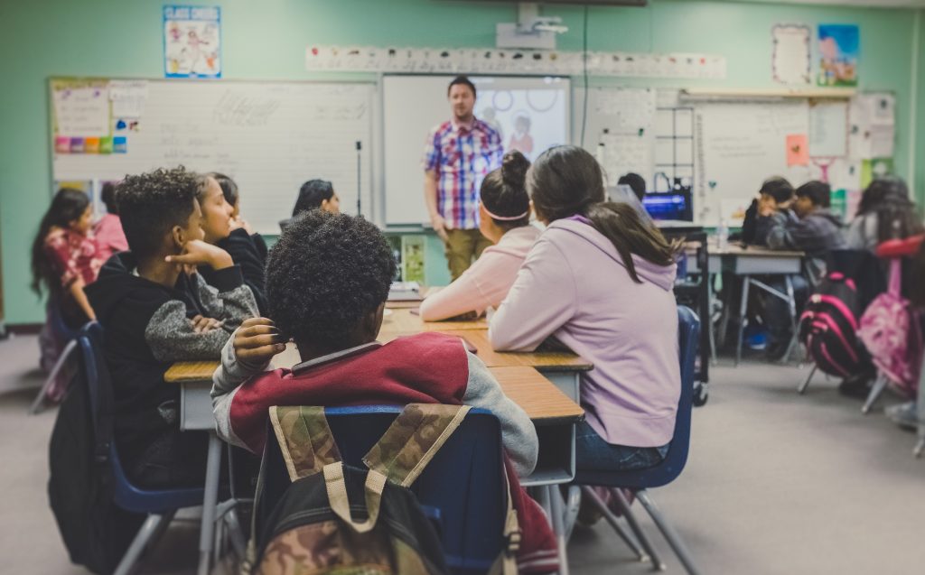
Although we knew the fully developed app should be usable across many different types of devices, we decided to prototype for an iPad.
iPads are MBA’s primary tool in their education programs. They lend out iPads to schools that participate in their program and train teachers on using iPads for education. MBA’s first priority was to develop the app for an iPad.
iPads are also the most useful for students in the field. Students who do not participate in MBA programs generally had access to either Chromebooks or iPads, but iPads are more easily used in the field.
Although the full app would be responsive and device-neutral, we chose to focus on a landscape tablet orientation that would give us the most design space to show off features.
We could have included an infinite number of features, but we narrowed it down to four different categories to focus on the most educational impact.
- Content creation
- Collaboration
- Ownership
- Reflection
DESIGN
Then, we were finally able to start ideating and building a tangible product.

1. Ideation
We began by generating ideas with the whole team involved to make sure that the researchers were able to speak to user data and research findings as we considered different design choices.
Our first activity was to gather inspiration.
- We looked at existing apps for organizational, functional, and stylistic inspiration.
- We noted specific elements and features that represent a “standard” that users would be accustomed to, so we could leverage that familiarity.
Next, the team came together for collaborative exercises.
- We had group discussions to share inspiration, including likes and dislikes of particular style choices or functionalities and why.
- We also did exercises like crazy 8s to help generate a high volume of ideas for how specific features would look and operate.
We also examined branding requirements for our app.
- We conducted an in-depth review of the aquarium’s style guide to ensure that the prototype would be consistent with client branding.
2. Wireframes
Wireframes were our first major milestone.
The designers focused on building out the high-priority features established during our foundational research phase. Then, the whole team collaboratively reviewed and revised the wireframes before presenting them to the client for further feedback and updates.
This ensured that the ‘shape’ of our prototype would match up with user needs uncovered in research, as well as client expectations.
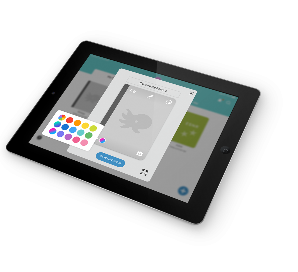
DASHBOARD IMAGE TK
The dashboard houses notebooks you’ve created, as well as notebooks that are shared with you.
From the dashboard, you can create a new notebook, navigate to your projects within a notebook, organize content, search all content, view notifications, and access your profile.
APP ARCHITECTURE IMAGE TK
The notebook is the highest level of organization, and contains one or more projects.
Projects are the middle level of organization. They are distinct bodies of work within a notebook, and contain one or more pages.
Pages are the lowest level of organization and are where content is created.
Our wireframes were developed around user flows that illustrated specific steps users would take to use key functions of the app.
- Add text
- Take photos
- Add sensor data
- Add feedback
- View feedback
- Notebook personalization
- Customize profile
- Annotations
- Search
3. Prototype: version one
Using wireframes as a guide, the designers then created the first version of our high-fidelity prototype. Because we knew we wanted to do usability testing, the designers focused on developing key user flows in the prototype to align with our testing goals.
This ensured that the designers were making the most of a quick timeline rather than building out features we knew we weren’t going to test, and that the researchers could work at the same time to write the testing protocol.
To create the initial prototype, the designers leaned on previous research, ideation, style guidelines, and feedback. Using Figma allowed real-time design collaboration within the team, so that the designers could work concurrently.
Our goal was to create a clean and easy to navigate UI that would be suitable for students of a wide range of ages and technological literacy. We chose colors that would align with the aquarium’s style guide and leaned on design conventions from Google and Notability that our users would be familiar with.
Before the prototype was ready for usability testing, the whole team went through several rounds of internal revision on prototypes, making sure that it functioned as needed and matched the testing protocol.
We decided to test on iPads using the Figma Mirror app. This created an immersive experience for participants, but also greatly limited our prototyping and testing capabilities due to Figma Mirror’s instability. The more complex our prototypes and testing scenarios were, the more the prototype crashed.
USABILITY TESTING
Our goals for usability testing were to understand usability problems that would impact the real-world use of the app, and to gather qualitative data for iterative design. Only by putting the prototype in front of actual users would we be able to determine which design choices worked, and which needed to be changed.
1. Usability testing: round one
We focused our testing on the following research questions to ensure that our prototype was headed in the right direction and to make sure we collected useful data for further revisions.
UI and Design
- Is the overall layout of the notebook easy to use for a first timer without instructions or training?
- Do UI elements support recognition and ease of use?
- Are the language and icons appropriate and understood by a variety of age ranges?
Information Architecture
- Does the organization of the notebook support how users work in the real world
- Does the notebook provide a findable and usable navigation?
Features
- Are users able to accomplish the tasks we outlined?
We developed our test scenarios to walk users through the main functions of the app as determined in the wireframes.
- Organization/navigation: create a notebook, project, and sections
- Content creation: text, sensor data, photos, annotations
- Feedback: add and view feedback
- Personalization: edit notebook cover and profile
- Search: search everything
After testing, we reviewed our notes and videos of the sessions to synthesize user feedback and make recommendations.
After round one of testing, we knew we had areas for improvement for both our testing protocol and the prototype design. We had a team discussion to decide which features should be revised and retested, and which features could be revised without further testing, since real-world limitations prevented us from testing everything.
The designers then worked to build new features and flows for the second round of testing.
Most of our overall feedback was positive feedback, with many participants telling us how excited they were to see future iterations of the app.
What Worked Well
- Look and feel of UI: students and teachers appreciated how clean the interface was and generally found the app easy to use and navigate. Commonalities to Google apps and Notability helped.
- Information architecture: students and teachers found the app’s organization of notebooks, projects, and sections useful and easy to understand.
- Features: students and teachers enjoyed using personalization, feedback, search, and content creation tools.
But we also discovered certain features and designs that participants struggled to use or find.
Issues Identified
- Design and UI: personalization menu icons and content creation toolbar
- Findability: findability of text formatting menu and sensor data menu
- Features: no app onboarding, no add/import file feature
2. Prototype: version two
The second version of the prototype included several new additions and improved upon features noted in the previous round of testing.
3. usability testing: round two
In our next test, we wanted to provide opportunities to validate solutions and to test the additional research-supported features not covered in round one. Our focus was to delve deeper into users’ mental models around the core functions of the app.
We also decided to switch to the desktop version of Figma for the second round of testing rather than use the Figma Mirror app on an iPad like we did in round one. Although we lost fidelity by having participants test with a touchpad and a laptop, we were able to test with greater stability and prevent interruptions of testing scenarios due to frequent crashes.
Like before, we worked together to revise the prototypes internally before finalizing them for testing.
Findability of Features
- Are users able to find the features that we changed, including menus and icons
Expanded Functionality
- Do the new help overlays and introduction help users understand how to use the app?
- Does the pages sidebar function as users expect?
UI Updates
- Do icon and design updates make sense to users?
- Welcome: view tutorial, explore help features
- Information architecture: add sections, add a page
- Text formatting: choose between version a and b
- Collect data: test use of top menu vs. keyboard menu
- Comments: view a new comment
- Personalization: test updated icons
After testing, we again examined our notes and videos to note successes and further areas of the prototype to refine.
Again, people were very excited by the app, how it looked, and how they might be able to use it in the future.
What Worked Well
- Look and feel of UI: test participants like the clean and simple aesthetic of the app.
- Findability: people responded well to the updated menu locations and were able to find the text and data menus much more easily.
- Personalization: Students and teachers commented on how much they loved being able to personalize covers.
While participants liked our updates from the previous round, we also uncovered more things that didn’t work for them.
Issues Identified
- Design and UI: icons (pages sidebar, help overlay, add text); new comments were not obvious
- Findability: personalization pencil tool menu; users preferred text formatting menu where options were laid out on keyboard
- Features: help overlay and tutorial language was vague; interactivity between sections and pages
4. Final prototype
Before finalizing our prototype for delivery to the client, the team reviewed potential solutions to usability issues together and chose ones that we felt were supported by our research.
The designers consolidated all prior feedback and research on features, flows, styles, elements, and information architecture to create the final prototype. They also standardized changes across all prototype screens, implemented consistent interactions, and designed a few new screens.
DELIVERABLES
As we finished up our final prototype, we turned our attention to the delivery phase. Our goal with each deliverable we produced was to make the handoff to future teams working on this project as seamless as possible.
We produced a video to get buy-in from stakeholders at the aquarium and donors who might fund development. We also built this website to explain our process and lay out our findings so that the next team to work on this would understand our rationale and decisions.
IMPACT
In the short term, we envision INK being used in MBA’s education programs and in the classrooms of teachers affiliated with the aquarium. Because INK will be device-neutral and able to be used on both Android and iOS, it should be adaptable to each teacher’s technological resources. Since Monterey Bay Aquarium’s programs teach science, the app will be mostly used in science classes at first.
However, in the long term, we’d like to see INK adopted in classrooms across the country, and even the world. We sought to design an app that could be used to teach all subjects, and expect that teachers of every discipline could benefit from a notebook tool designed specifically for education.
We look forward to seeing INK come to life and hope that in the future, it will be used not only at Monterey Bay Aquarium, but in classrooms all over.